Tags: OnColor, color space, color specification, color matching, color formulation
When installing the OnColor color QC and formulation software under Windows 7 or Vista, there are some settings in the operating system that should be noted.
Tags: OnColor, color computer, Vista, Windows 7, Product Information
Much of this blog series has been focused on the instrument and getting the best possible inter-instrument agreement. However, we can’t forget the basics of good practice in color measurement when it comes to sample presentation. Some types of samples can be very repeatable to present to the instrument, while others pose more challenges.
Tags: color tolerances, electronic color standards, color matching, color standard, inter-instrument agreement, translucency, color spectrophotometer, spectrophotometer

While sharing the data for electronic color standards may seem like a “no brainer”, it’s easy to fall into the trap of making the assumption that the person at the receiving end of the data knows how it was obtained and how to use it. So here are some best practices to follow to make things go smoothly.
Tags: electronic color standards, OnColor, standard observer, illuminant, color space, global color communication
Tags: color tolerances, electronic color standards, instrument profiling, inter-instrument agreement
With today’s increasingly tight color tolerances and a global supply chain, it’s getting tougher to meet color specifications and tolerances. How can you be assured that when you certify instrumental color data, you can do so with confidence?
Tags: color tolerances, electronic color standards, spectrophotometer diagnostics, global color communication
What is Inter-Instrument Agreement? Should I care? How do you determine it? How do I know what my numbers are? Can I measure it myself?
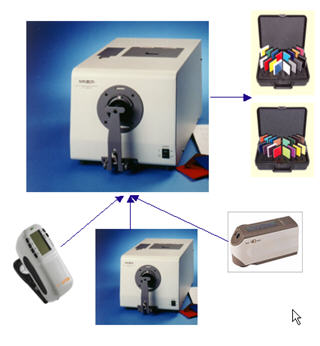
Tags: electronic color standards, color standard, instrument profiling, inter-instrument agreement, color spectrophotometer, spectrophotometer
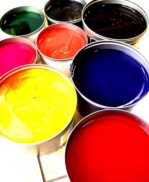
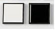
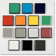
Before generating an electronic color standard, a physical standard needs to exist and be measured to generate the electronic data. Here are some guidelines for selecting the specimen and storing and handling it:
Tags: color matching, color formulation, color standard, global color communication
The next fundamental rule in sharing electronic color standards is that the color parameters using in the calculation of the coloriemtric data must be the same.
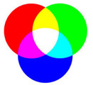
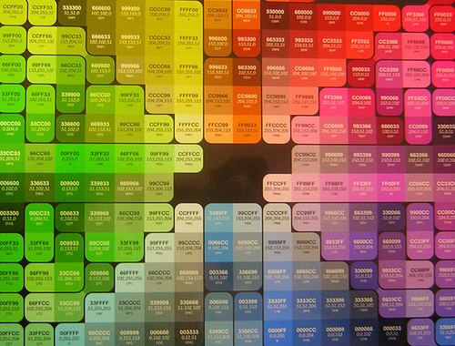
Tags: color tolerances, standard observer, illuminant, color space, global color communication, instrument geometry, color spectrophotometer
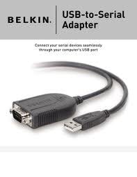
While many of the new spectrophotometers on the market today are equipped with a USB cable to connect to the PC, most of the older models still use a serial communications cable to communicate with the PC. USB to serial adapter cables can bridge the gap for those PC's that do not have a serial port installed on their PC. There are many such devices available, but not all work well with the high demands of data transfer of a color spectrophotometer--especially not on a 64-bit PC.
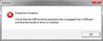
Tags: OnColor, USB adapter, Windows 7, color matching, color spectrophotometer